SolarSmart

UI Design & Brand Identity Development
Project Overview
SolarSmart is a pioneering company committed to revolutionizing the renewable energy landscape by harnessing the boundless power of the sun. Established in 2000, SolarSmart has consistently delivered innovative and sustainable energy solutions to homes, businesses, and communities. This case study delves into the comprehensive design process behind SolarSmart's visual identity, encompassing the logo, brand style guide, website, and design system, meticulously crafted by me.
Project Brief
SolarSmart specializes in using renewable energy to provide electricity to homes, businesses, and communities through the use of sunlight and solar panels. Since its inception in 2000, SolarSmart has grown significantly, establishing itself as a reliable and innovative force in the renewable energy sector.To further their mission and create a cohesive brand experience, SolarSmart required:
  • A new logo
  • A brand style guide
  • A website
  • A design system
The objective was to ensure consistency across all touch points and provide a more relevant look and feel. Additionally, SolarSmart aimed to raise awareness about the importance of using renewable energy to generate electricity.SolarSmart's brand personality is defined by competence, striving to be reliable, successful, hard-working, and intelligent. The target audience includes homeowners and business owners, evenly split between males and females aged 30 to 50, who value learning about renewable energy and support companies committed to combating climate change.
Design is a process that requires logical thinking and clear problem-solving to address the brief effectively. Here’s a detailed look into my design process for the SolarSmart project, highlighting how I approached and solved various design challenges.
My Design Process
Step 1: Understanding the Brief
The first step in my process was to thoroughly understand the project brief provided by SolarSmart. This involved identifying the key requirements:
Additionally, I needed to grasp the brand's personality, which emphasizes competence, reliability, success, hard work, and intelligence. The target audience comprised homeowners and business owners aged 30 to 50 who value renewable energy and support sustainable practices.
  • A new logo
  • A brand style website
  • A website
  • A design system
Step 2: Research and Inspiration
To align the design with SolarSmart's mission, I conducted comprehensive research on renewable energy, solar panel technology, and market trends. I also studied competitors and industry leaders to identify gaps and opportunities for SolarSmart’s brand identity.
Step 3: Concept Development
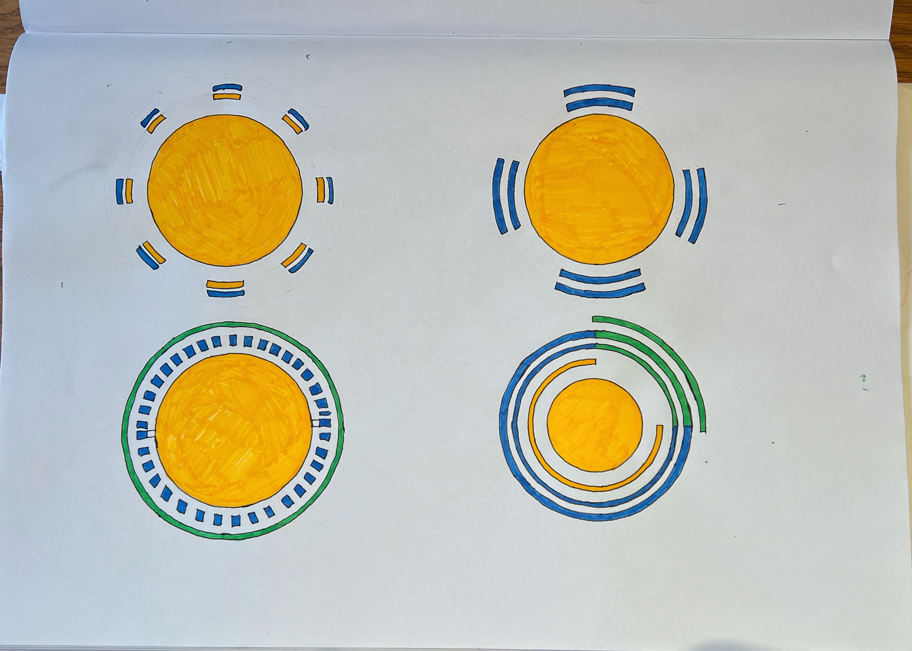
With a clear understanding of the brief and insights from my research, I began developing initial concepts. For the logo, I experimented with various sketches, focusing on simplicity and symbolism. The concept of using a yellow circle to represent the sun, coupled with blue and green lines to signify energy transmission, emerged as the most compelling visual narrative.
Step 4: Refinement and Iteration
  • Sunshine Yellow (#FFC700): Representing solar energy and optimism. This vibrant yellow emerges as the primary brand color, embodying SolarSmart's unwavering commitment to intelligent power solutions.
  • Sky Blue (#3473CD): Representing clarity of the sky and solar panels. This blue shade conveys reliability and trust, complementing and elevating the brand's visual identity.
  • Eco Green (#4CAF50): Underscoring eco-friendly practices and sustainability. This green hue underscores SolarSmart's dedication to environmentally conscious energy solutions.
After selecting the most promising logo concept, I refined it through multiple iterations. I tested different color combinations, line thicknesses, and compositions to ensure the logo was both visually appealing and meaningful.

The logo features a prominent yellow circle paired with a partially completed yellow circle, standing at 75% completion. Interwoven with these elements are blue and green lines, symbolizing the transmission of green energy. This design symbolism signifies the sun, serving as the primary energy source that transmits power to the blue solar panels.Subsequently, the solar panels radiate green energy, offering a visual narrative of the renewable energy process. Beyond this, the color palette chosen carries deeper connotations, embodying the sun, sky, and the verdant earth.
Step 5: Brand Style Guide
Creating the brand style guide involved defining the visual and verbal elements that would ensure consistency across all touchpoints. I chose the Montserrat typeface for its modernity and clarity, ensuring it would be legible and professional. The guide also included high-quality imagery, iconography, and a color palette that aligned with SolarSmart’s values.

Challenges and Solutions:
  • Balancing Playfulness and Professionalism: I incorporated 3D illustrations to add a dynamic element without compromising the guide’s professional tone. Strategic placement and cohesive design language ensured readability and engagement.
Step 6: Website Design
For the website, my goal was to create an immersive and engaging experience that stood out from conventional designs. I used vibrant colors and interactive elements to captivate visitors and encourage exploration. The layout was designed to be intuitive, facilitating easy access to information about renewable energy and SolarSmart’s offerings.

Challenges and Solutions:
  • User Experience: Balancing entertainment and information was crucial. I ensured a seamless user experience by making thoughtful design decisions that prioritized both engagement and clarity.
The design system was critical for maintaining consistency across digital platforms. It included detailed guidelines for typography, icons, buttons, and color palettes. Emphasizing accessibility, I ensured that the design system accommodated both light and dark modes, making the digital experience inclusive and user-friendly.

Challenges and Solutions:
Step 7: Design System
  • Harmonizing Information for Developers and Designers: I provided clear visual examples and concise guidelines, making it easier for developers to implement design elements accurately.
My design process for SolarSmart was a blend of research, creativity, and iterative refinement. By understanding the brief, conducting thorough research, and logically solving design problems, I created a cohesive and impactful visual identity for SolarSmart. This methodical approach not only addressed the client’s needs but also enhanced my design proficiency, showcasing my ability to think critically and innovate effectively.

My contributions to the SolarSmart project have resulted in a strong, consistent, and engaging brand presence. This case study highlights my process-driven approach, demonstrating how logical thinking and clear problem-solving can lead to successful design outcomes.
Conclusion